Designing a flyer used to mean hiring a graphic designer, wrestling with complex software, or settling for a dull, generic layout. Today, the landscape has changed dramatically. With thousands of flyer design templates available online, anyone, regardless of skill level, can produce professional-quality promotional materials in a fraction of the time. Whether you are promoting a local event, launching a business, or advertising a sale, the right platform and the right template can turn a blank canvas into a polished, print-ready flyer in minutes.
Why Online Flyer Templates Have Become the Go-To Solution
The explosion of online design tools has democratized visual communication. Small business owners, nonprofit coordinators, freelancers, and students no longer need to rely on expensive print shops or design agencies to produce eye-catching materials. Online template libraries give users an immediate head start by providing professionally designed layouts that can be customized with your own text, colors, images, and branding.
Templates save time, reduce stress, and eliminate the intimidation factor that often comes with starting from scratch. Instead of staring at a blank page, you begin with a strong visual foundation. This is especially valuable when you are working under a deadline or producing multiple pieces of collateral at once.
Beyond convenience, the quality of online templates has improved significantly over the years. Many platforms collaborate with professional designers to build their libraries, which means the layouts you are choosing from are already optimized for visual hierarchy, typography pairings, and color contrast. You benefit from design expertise without needing any yourself.
What to Look for in a Flyer Design Resource
Not all template platforms are created equal. Before committing to a tool, it is worth evaluating a few key factors that will determine how useful and efficient the experience actually is.
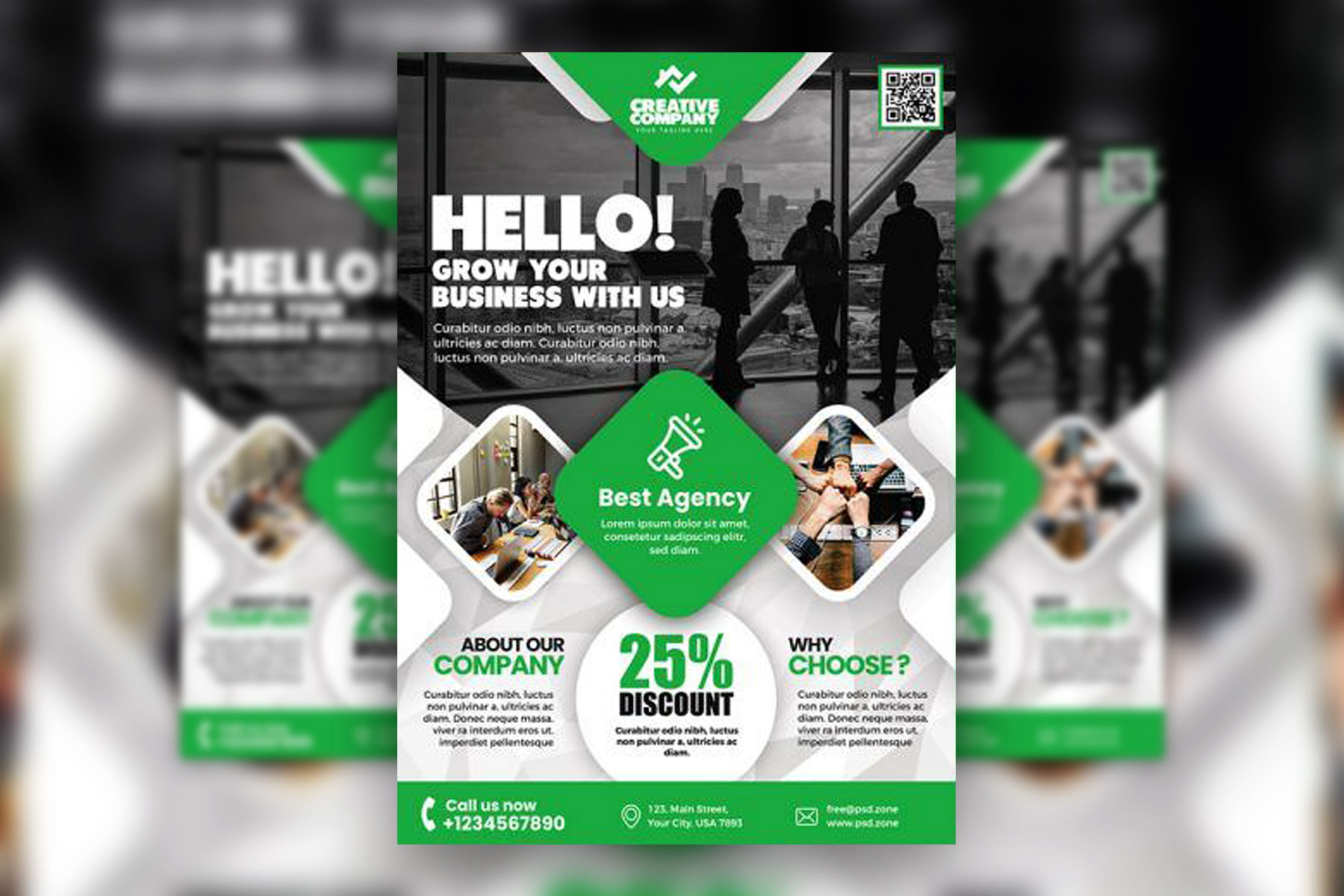
Template variety and depth. A strong platform offers templates across dozens of categories, including event flyers, business flyers, sale announcements, real estate promotions, fitness classes, food and beverage promotions, and more. The more specific the categories, the easier it is to find a starting point that is already relevant to your needs.
Customization flexibility. Templates should be fully editable. Look for tools that allow you to change fonts, swap colors, resize elements, upload custom images, and reposition design components freely. If a template feels rigid or locked, it limits your ability to align the design with your brand.
Export and download options. Consider what file formats are available for download. PDF is standard for print, while PNG or JPG works well for digital sharing. Some platforms also offer direct social media sizing or the ability to print from within the tool itself.
Ease of use. Drag-and-drop interfaces, intuitive toolbars, and clear navigation make a significant difference, especially for users who are not trained designers. A clean user experience reduces the learning curve and lets you focus on the creative work rather than the mechanics of the tool.
Top Tips for Fast and Effective Flyer Design Using Online Templates
1. Start With a Template That Matches Your Industry or Occasion
Rather than browsing a generic library, filter by your specific use case from the start. If you are designing a flyer for a music event, search within the event or entertainment categories. If you are promoting a sale, go straight to the retail or promotional templates. Starting with something contextually relevant means less editing overall.
Most platforms organize their template libraries by category, season, and purpose, which dramatically speeds up the selection process. Spending two minutes finding the right template can save you twenty minutes of editing later.
2. Use Adobe Express to Create a Flyer Quickly With Professional Results
One of the most accessible and powerful tools available for flyer creation is Adobe Express. If you want to create a flyer that looks polished and print-ready without needing professional design experience, Adobe Express offers a robust library of customizable templates spanning dozens of categories and styles. The platform is designed for speed and simplicity, with a drag-and-drop editor, built-in font pairings, branded color palettes, and one-click background removal. Whether you need a digital flyer for social media or a print-ready file for physical distribution, Adobe Express covers both use cases seamlessly. Its integration with Adobe’s broader ecosystem also means access to premium assets, making it a strong choice for anyone who wants consistent, high-quality results without a steep learning curve.
3. Lock In Your Brand Colors Before You Start Editing
One of the most common mistakes in flyer design is editing a template and then realizing mid-process that the colors do not align with your brand. Before you start swapping out headlines and images, input your brand’s hex color codes into the editor and apply them to your design first. This gives you an immediate sense of whether the template is a good fit and prevents rework later.
If you do not have formal brand guidelines, keep it simple: choose one primary color, one accent color, and use white or a neutral tone as the background. A limited palette creates cohesion and makes the flyer easier to read at a glance.
4. Prioritize Hierarchy With Headline, Subhead, and Body Text
A well-designed flyer communicates its core message within three seconds. To achieve this, use a clear visual hierarchy. Your headline should be the largest and boldest element on the page. The subhead or supporting details come next, at a slightly smaller size. Body text, dates, times, and locations should be readable but subordinate to the main message.
Many templates already build this hierarchy in, but when you start swapping out text, it is easy to accidentally disrupt it by making everything the same size. Resist the temptation to use more than two or three font sizes across your entire design.
5. Replace Stock Photos With Images Specific to Your Brand
Templates almost always come with placeholder stock photography. While stock images can work in a pinch, replacing them with real photos of your product, team, event space, or location immediately makes the flyer feel more authentic and trustworthy.
If you do not have high-quality photos on hand, choose stock images that feel genuine rather than staged. Candid, real-world scenes typically read better on promotional materials than overly posed stock photography. Most online design tools include a built-in image library to help, and many offer access to premium assets for free or at a low cost.
6. Keep Copy Concise and Action-Oriented
Flyers are scanned, not read. Every word on your flyer needs to earn its place. Cut any information that does not directly serve the call to action or communicate essential details. Use short, punchy sentences. Lead with the benefit to the reader, and end with a clear call to action: “Register Today,” “Call Now,” “Visit Us This Weekend.”
One effective approach is to draft your copy separately before entering it into the design tool. Write everything out in full, then ruthlessly edit it down to only the essential information. This helps you avoid the temptation to stuff too much text into the layout.
7. Use White Space Intentionally
Beginners often try to fill every corner of a flyer with text, images, or decorative elements. Professional designers know that white space, the empty areas around and between design elements, is just as important as the elements themselves. It gives the eye a place to rest and makes the overall composition feel balanced and easy to navigate.
When editing a template, resist the urge to add more. If anything, consider removing elements to create breathing room. A clean, uncluttered flyer almost always outperforms an overcrowded one.
8. Tailor the Format to Where the Flyer Will Be Seen
A flyer designed for a community bulletin board has different requirements than one that will be shared as an Instagram story or emailed to a subscriber list. Physical flyers need higher resolution files (300 DPI for print) and should account for margins and bleed if they are going to be cut. Digital flyers can be lower resolution but should be sized correctly for the platform they will appear on.
Many online design tools now offer preset dimensions for popular formats, including standard US letter, A4, Instagram square, Instagram story, and Facebook event cover. Choosing the right dimensions at the start saves significant time and ensures your design translates well to its intended medium.
9. Take Advantage of Font Pairing Suggestions
Typography is one of the most nuanced elements of design, and it is also one of the easiest to get wrong. Mismatched fonts can make a flyer look amateurish even if everything else is well done. Many online template tools include curated font pairings, meaning a header font and a body font that have already been tested together for visual harmony.
When in doubt, stick with the font pairing that came with your chosen template. If you want to swap fonts, look for pairings that contrast in style without clashing. A bold sans-serif headline often pairs well with a clean, legible serif or neutral sans-serif body text.
10. Preview in Multiple Sizes Before Downloading
Before you export your final flyer, preview it at the size it will actually be seen. Zoom out to thumbnail size to see how it reads from a distance. Check that the headline is legible, the key details are visible, and the layout holds together without relying on small text to communicate anything critical.
Many designers make the mistake of reviewing their work only at 100% zoom on a large monitor. In reality, your flyer might be pinned to a bulletin board six feet away from the viewer, shared as a thumbnail on a social feed, or printed in a smaller format than expected. Designing for the actual viewing experience is the difference between a flyer that works and one that gets ignored.
FAQ
What makes a flyer template “print-ready,” and how do I know if mine qualifies?
A print-ready flyer meets specific technical requirements that ensure it reproduces accurately when sent to a professional printer. The most important factors are resolution (at least 300 DPI), file format (PDF is preferred for print), color mode (CMYK rather than RGB, which is designed for screens), and bleed (a small extension of the background color or design beyond the trim edge so there are no white borders after cutting). Many online design platforms now handle most of these settings automatically when you select a print download option. However, if you are sending your file to a commercial printer, it is worth confirming their specific requirements before exporting. Tools like Google Fonts can also help you identify free, commercially licensed typefaces that will render correctly in both digital and print environments.
How many templates should I review before choosing one?
There is no magic number, but design research suggests that decision fatigue sets in quickly when you are evaluating visual options. A practical approach is to filter your search as specifically as possible before browsing, which narrows the pool significantly. From there, plan to review no more than fifteen to twenty templates before making a choice. If nothing is clicking after that, refine your search terms rather than continuing to scroll. The goal is to find a template that requires minimal structural changes, meaning you mostly need to update the text, colors, and images rather than rebuild the layout. The closer a template is to your final vision from the start, the more time you save in editing.
Can I use online flyer templates for commercial purposes?
This depends entirely on the platform and the specific template or assets within it. Most reputable design platforms include licensing terms in their terms of service that outline how templates and included assets (photos, illustrations, icons) can be used. Templates themselves are generally fair game for commercial use once you have customized them, but the stock assets embedded within them may have restrictions. Always check whether the images or graphics bundled with a template are licensed for commercial use, especially if your flyer will be used to sell a product or service, promote a business, or generate revenue of any kind. When in doubt, replace stock assets with your own original photos or upload assets that you have licensed specifically for commercial use.
How do I make my flyer stand out when so many people have access to the same templates?
Customization is the key. The availability of templates is a starting point, not a limitation. Two people using the same base template will produce completely different results depending on the colors, fonts, photos, copy, and layout adjustments they make. The most impactful change you can make to any template is to replace the stock imagery with real, high-quality photos specific to your business or event. Beyond that, tailoring the color palette to your brand identity, writing copy that speaks directly to your audience, and adding any proprietary logos or graphic elements will make your flyer feel distinctly yours, even if the structural bones come from a shared library.
What is the best way to distribute a flyer once it is designed?
Distribution strategy should inform design choices from the beginning, so it is worth thinking about this before you finalize the layout. For physical distribution, printing at a local print shop or using an online print-on-demand service typically yields the best quality results. For digital distribution, the flyer can be shared directly via email, embedded in a newsletter, posted to social media, or uploaded to community boards and event pages. Some platforms allow you to share a live link to the design itself, which is useful if the flyer contains a URL or QR code that viewers can interact with directly. If you are managing a community event or campaign with multiple organizers, consider using a project management tool like Trello to coordinate distribution tasks, assign ownership, and track where the flyer has been shared.
Conclusion
The availability of thousands of flyer design templates online has fundamentally changed what is possible for individuals and businesses working without a dedicated design team. With the right platform, a strong starting template, and a few core design principles in your toolkit, you can produce professional-quality flyers that compete with anything a print shop or agency might produce. The key is knowing what to look for, moving efficiently through the template selection process, and customizing thoughtfully rather than haphazardly.
Whether you are a first-time designer or a seasoned marketer looking to streamline your workflow, resources like Adobe Express provide the template depth, editing flexibility, and export quality needed to create compelling promotional materials at any scale. The combination of accessible tools, smart customization, and clear messaging is all you need to design flyers that capture attention, communicate your message, and drive real results.